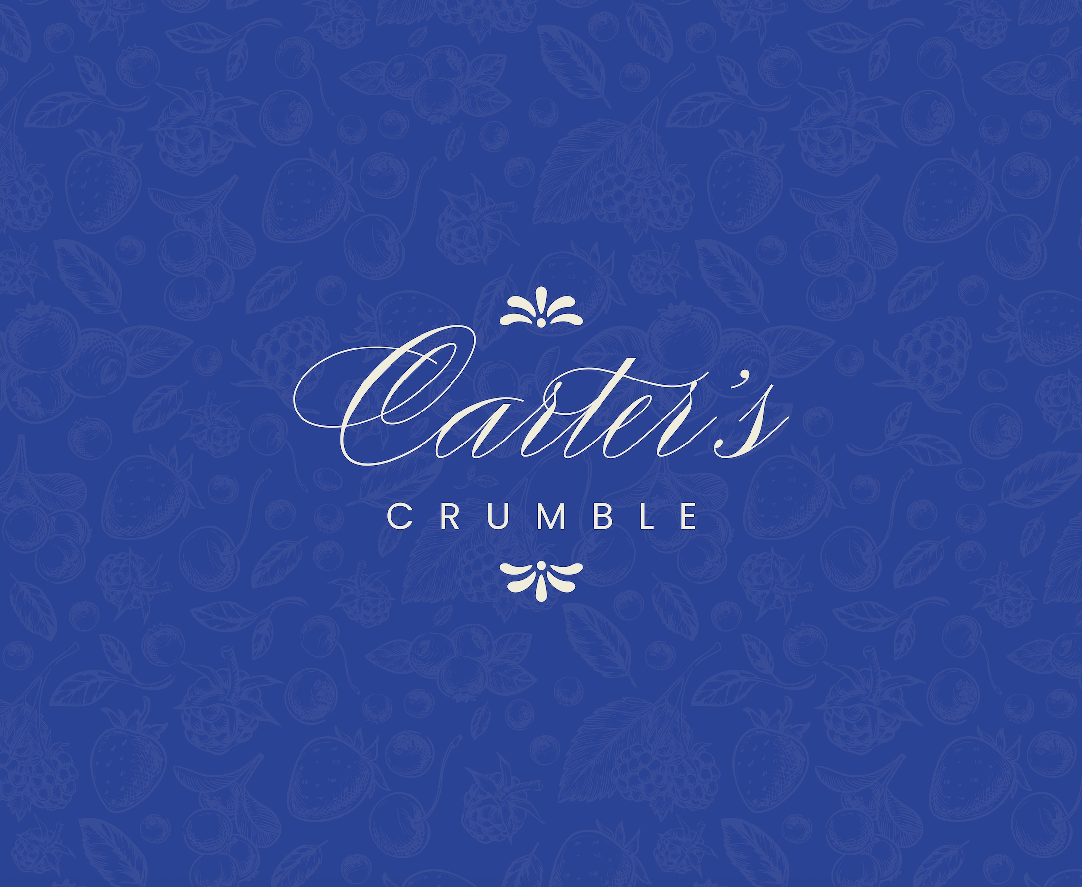
Carters Crumble
Carters Crumble is a small-batch dessert company founded by Emma Carter, a passionate baker dedicated to creating wholesome, comforting treats with a modern twist. What began as a simple farmers market stall has quickly grown into a beloved local favorite, known for its signature fruit crumbles made from scratch with organic, locally sourced ingredients. Each week, Emma brings her handmade crumbles to farmers markets, offering both ready-to-eat trays and scoops topped with fresh whipped cream. With classic flavors like blueberry and apple alongside rotating seasonal varieties, Carters Crumble celebrates the best of what’s fresh and local. Guided by a commitment to quality, community, and clean eating, Carters Crumble has expanded into select wellness-focused retailers and continues to grow through catering and online orders. Emma’s vision is simple: to share the joy of wholesome, thoughtfully made desserts that bring people together and make every moment feel a little sweeter.
VISUAL DIRECTION BRAND IDENTITY UI / UX DESIGN STATIONARY DESIGN PACKAGING DESIGN
2025
About the project
Carters Crumble approached me to develop a full branding suite that would capture the heart of their growing dessert business. Founded by Emma Carter, Carters Crumble is a small-batch baking company known for its handmade fruit crumbles crafted with organic, locally sourced ingredients. What began as a humble farmers market stall has quickly become a community favorite, celebrated for its comforting flavours and modern, wholesome approach.
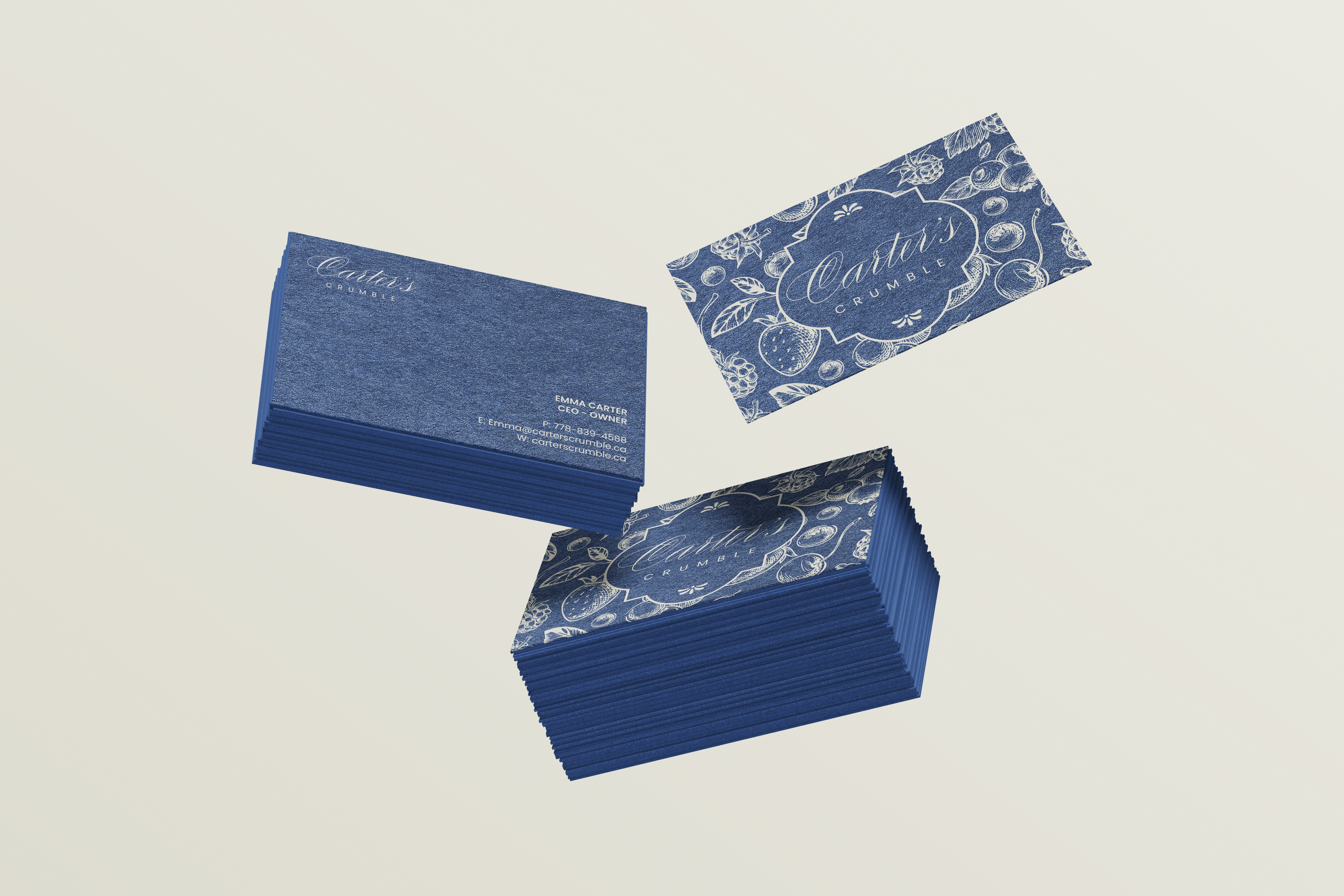
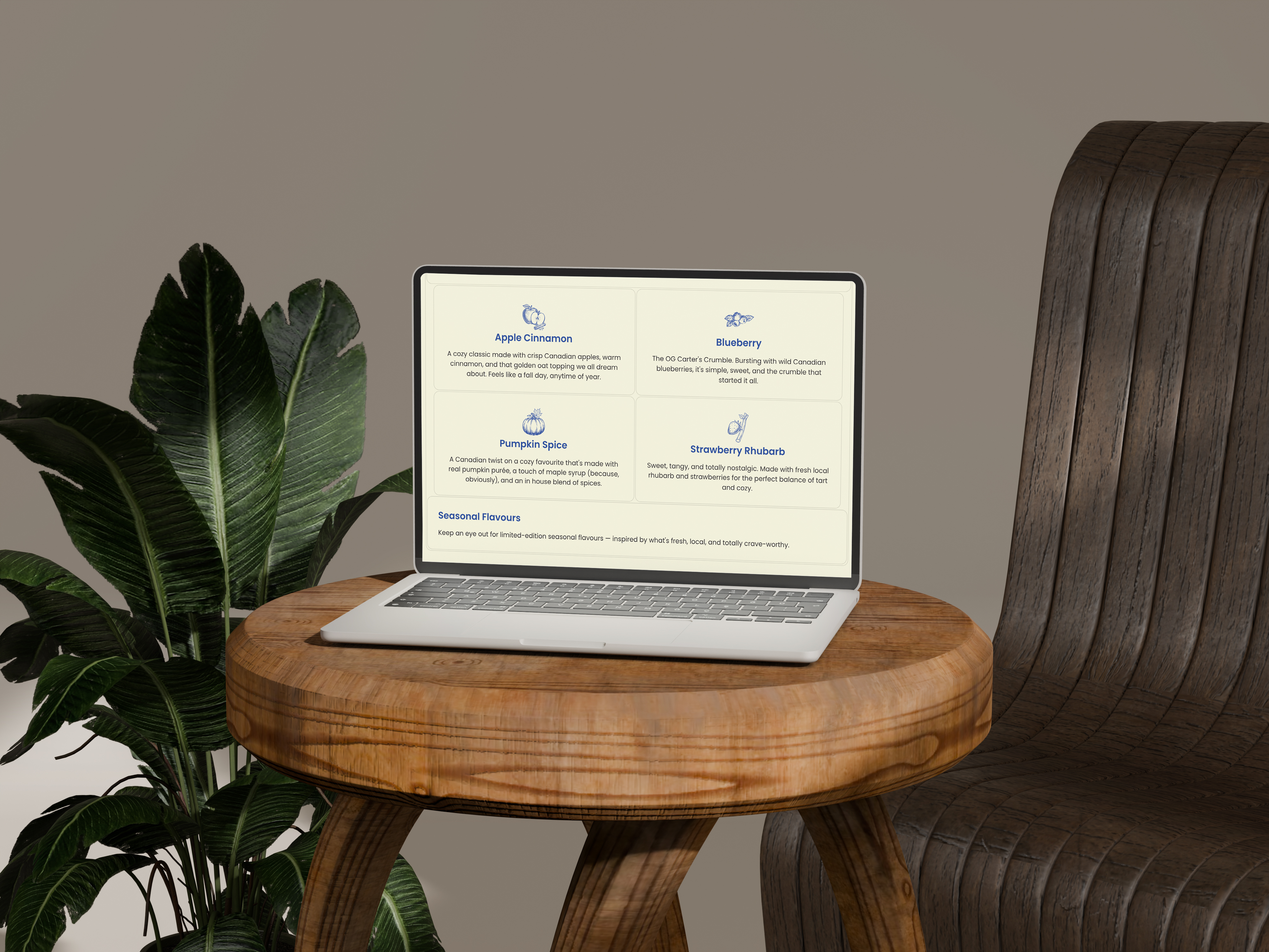
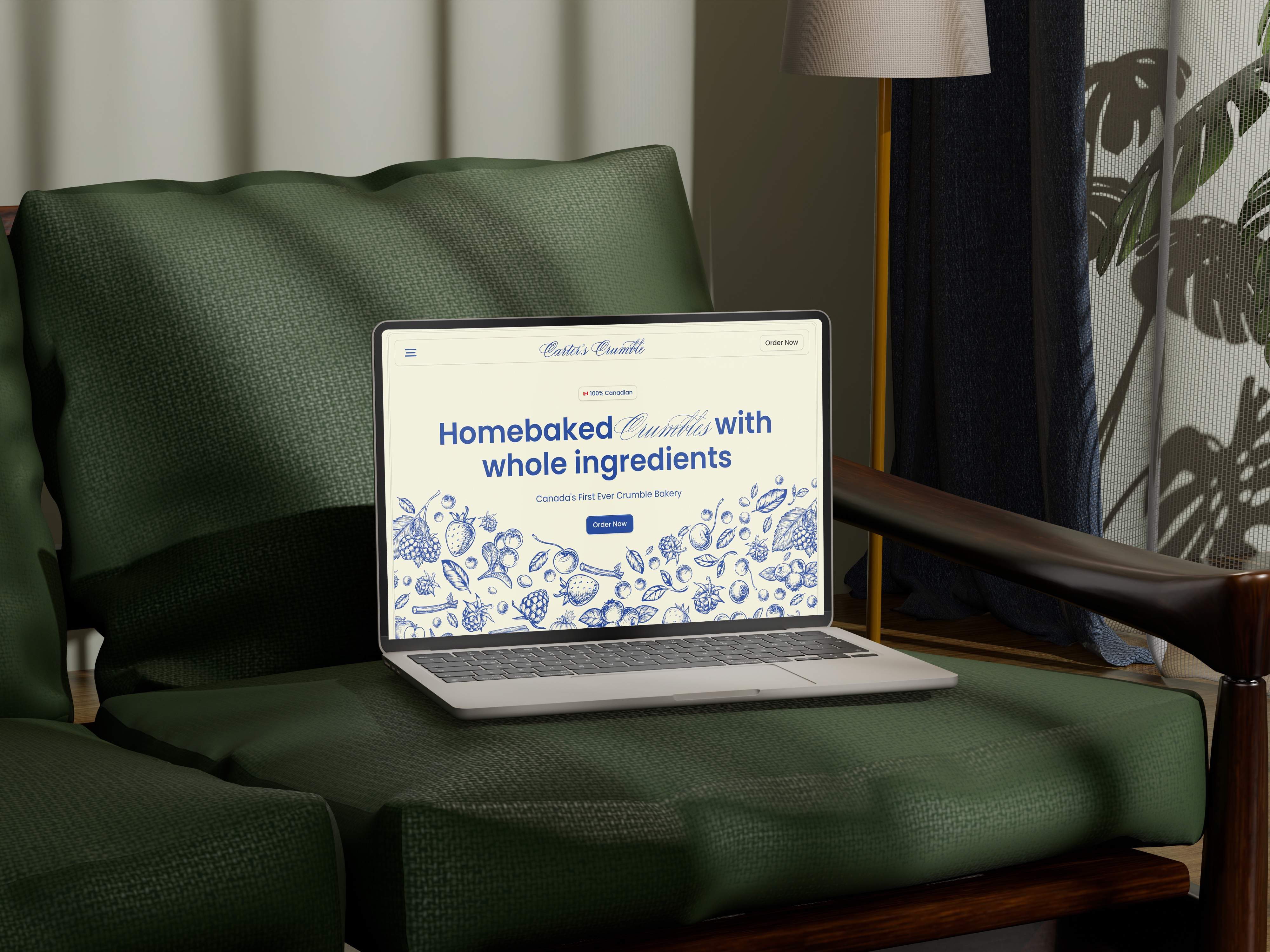
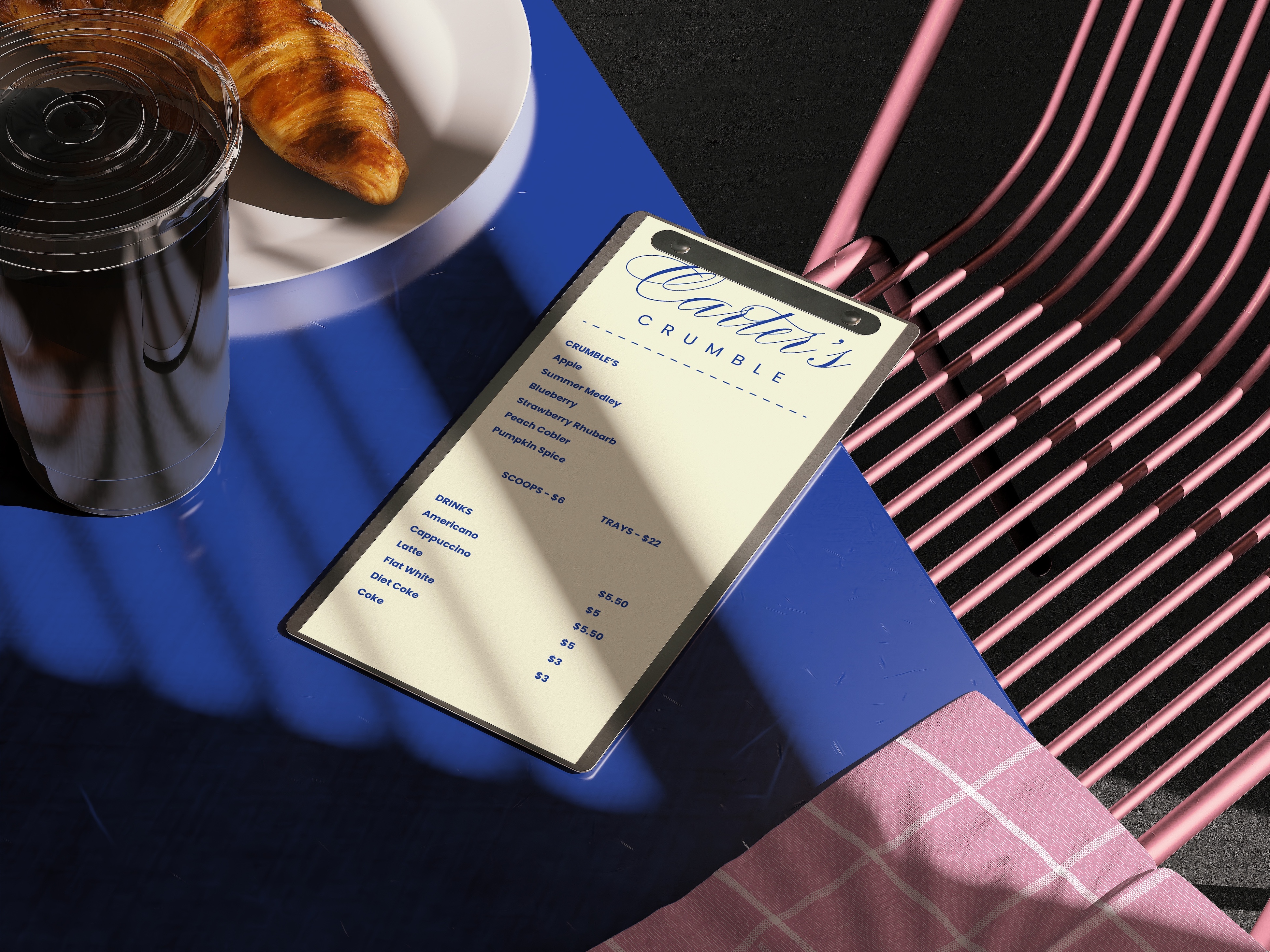
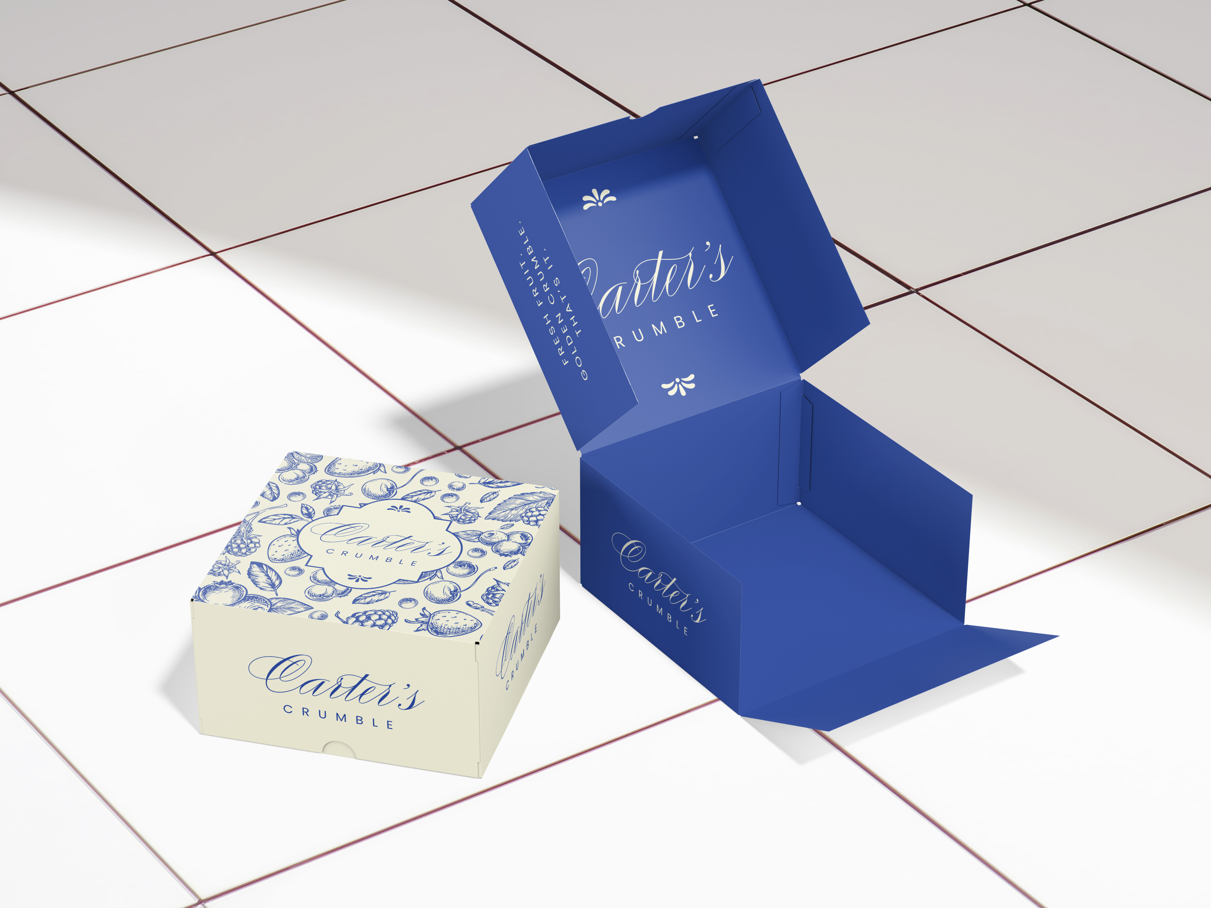
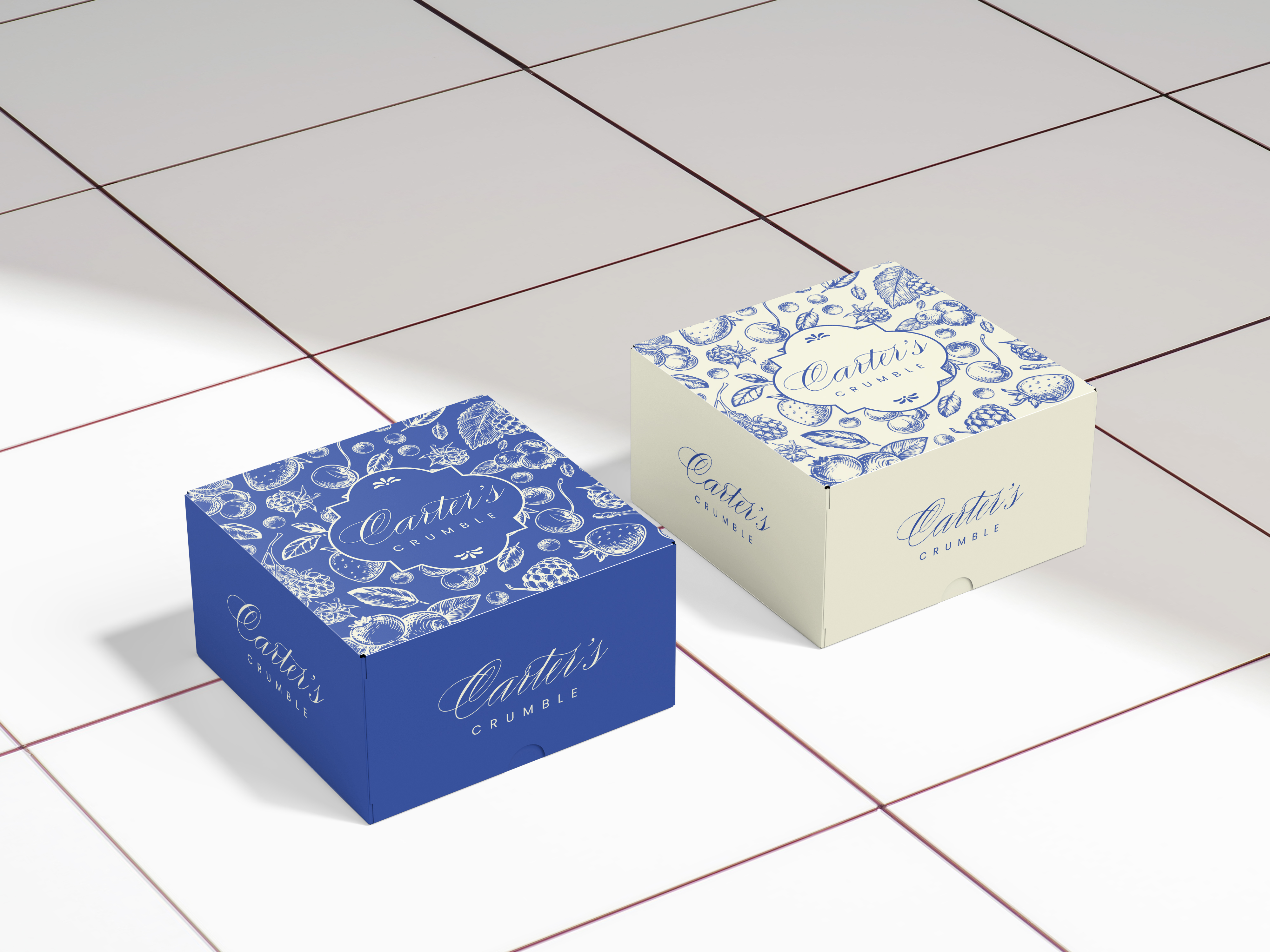
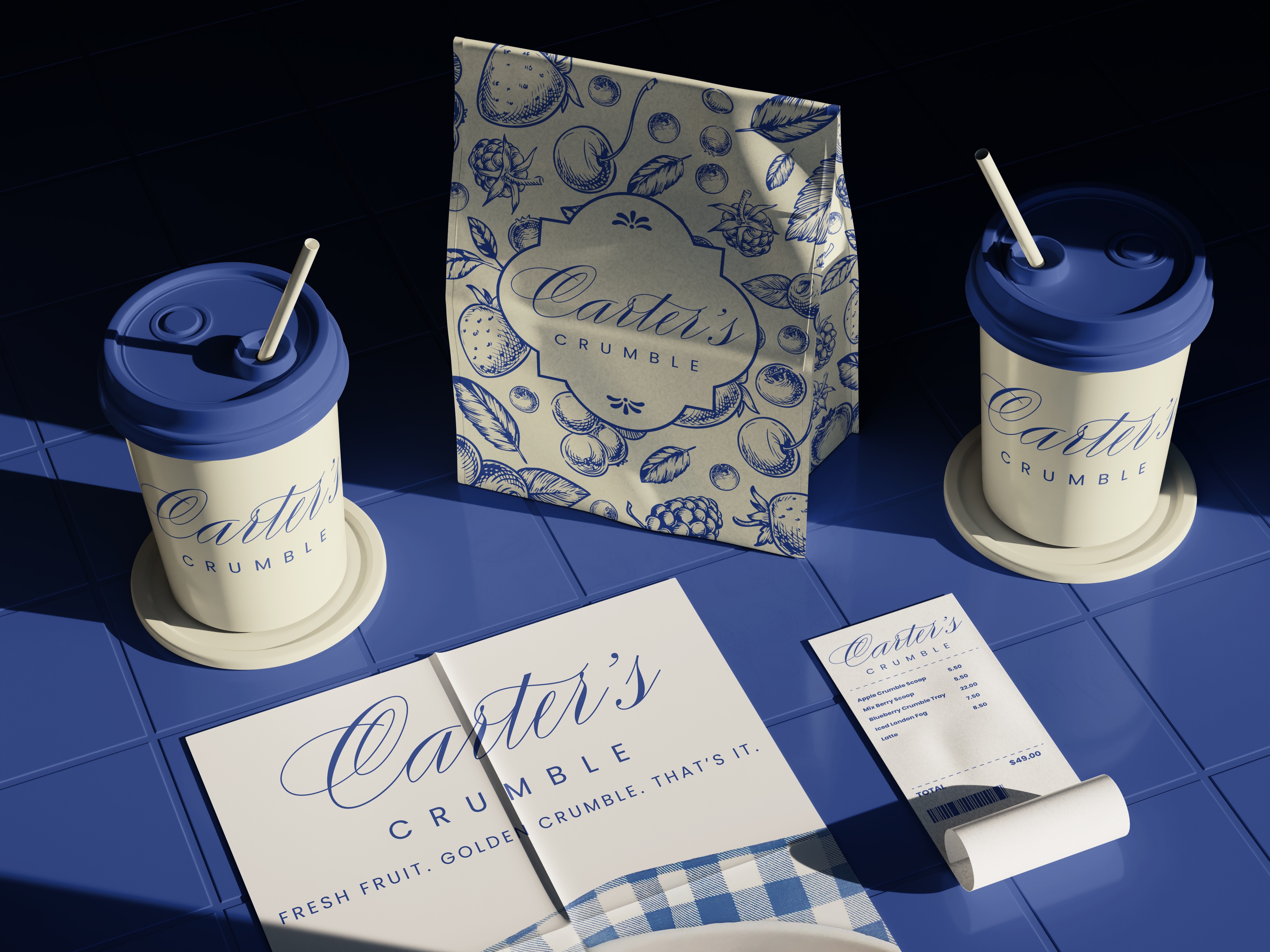
For this project, I created a complete brand identity system—including the primary logo, brand marks, colour palette, typography, and a comprehensive brand guide to support future growth. I also designed packaging, merchandise, signage, marketing collateral, and a fully custom website to ensure the brand feels cohesive across every touchpoint.
The goal was to build a visual identity that reflects the warmth, craft, and authenticity behind Emma’s crumbles while giving Carters Crumble the tools it needs to scale with confidence. The final result is a friendly, modern, and memorable brand system that brings the spirit of the bakery to life both online and in person.
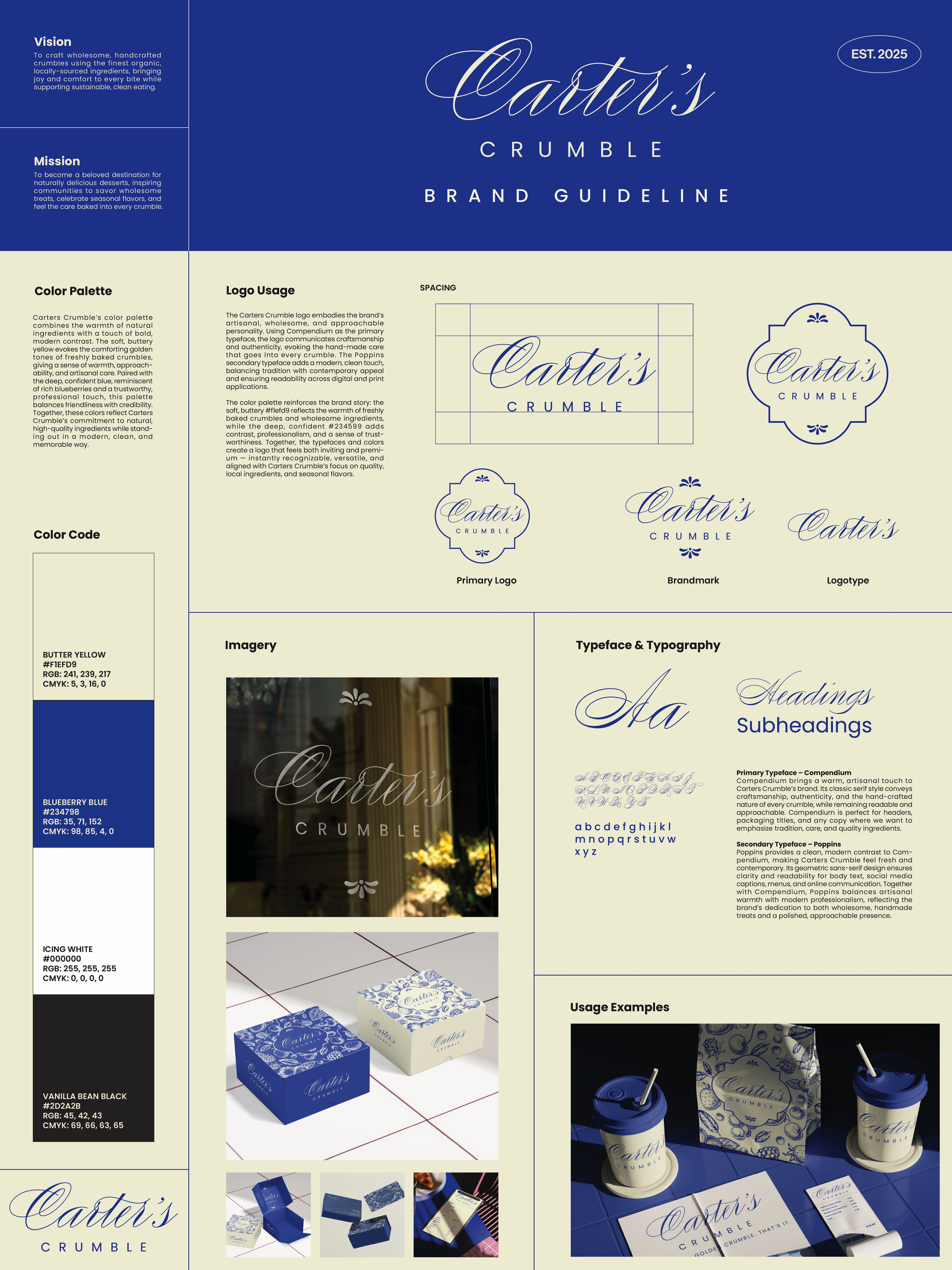
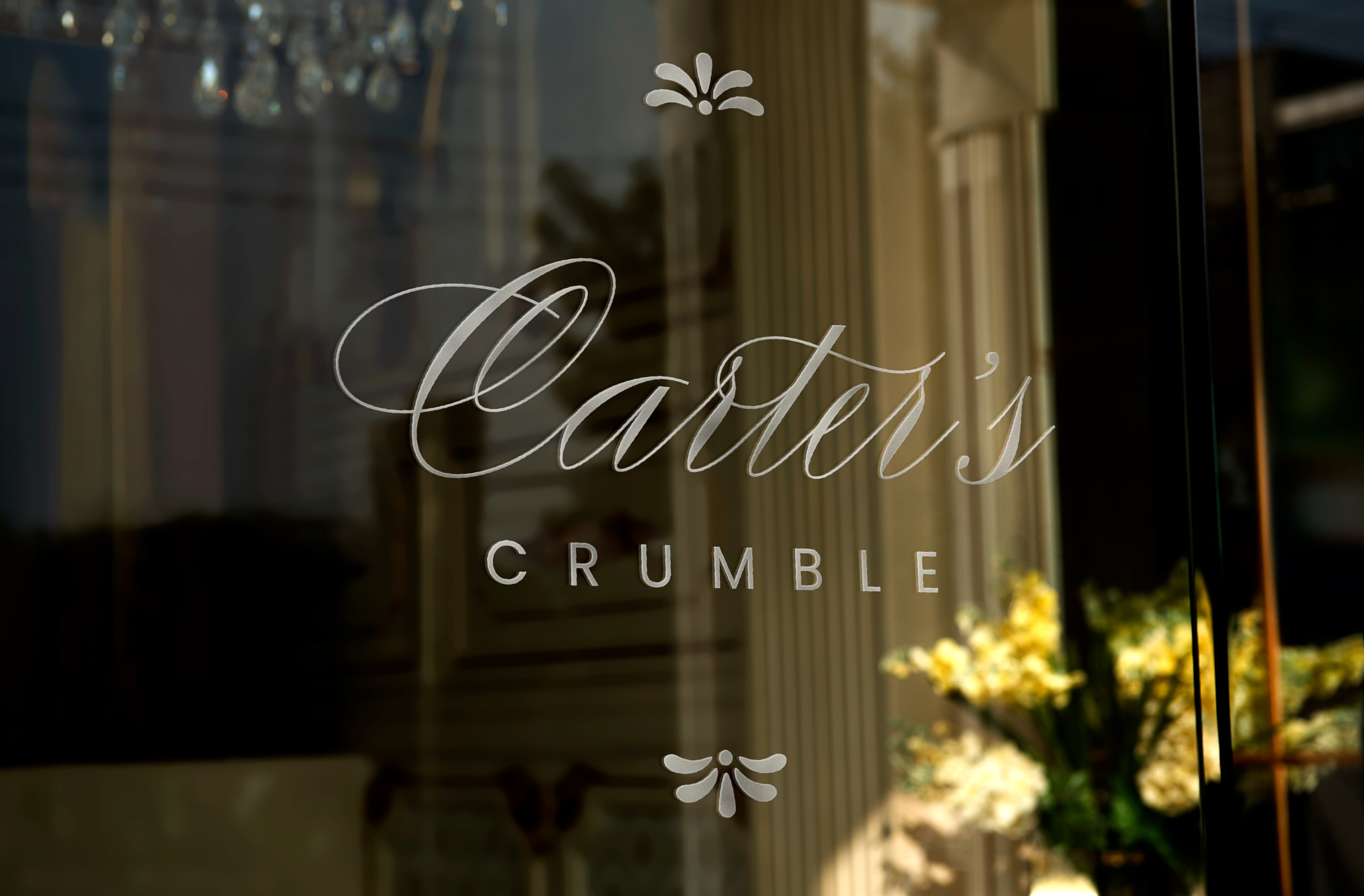
The Carters Crumble brand embodies the artisanal, wholesome, and approachable personality. Using Compendium as the primary typeface, the logo communicates craftsmanship and authenticity, evoking the hand-made care that goes into every crumble. Poppins the secondary typeface adds a modern, clean touch, balancing tradition with contemporary appeal and ensuring readability across digital and print applications.
The soft, buttery yellow we use reflects the warmth of freshly baked crumbles and wholesome ingredients, while the deep, confident blue adds contrast, professionalism, and a sense of trustworthiness. Together, the typefaces and colours create a logo that feels both inviting and premium — instantly recognizable, versatile, and aligned with Carters Crumble’s focus on quality, local ingredients, and seasonal flavours.