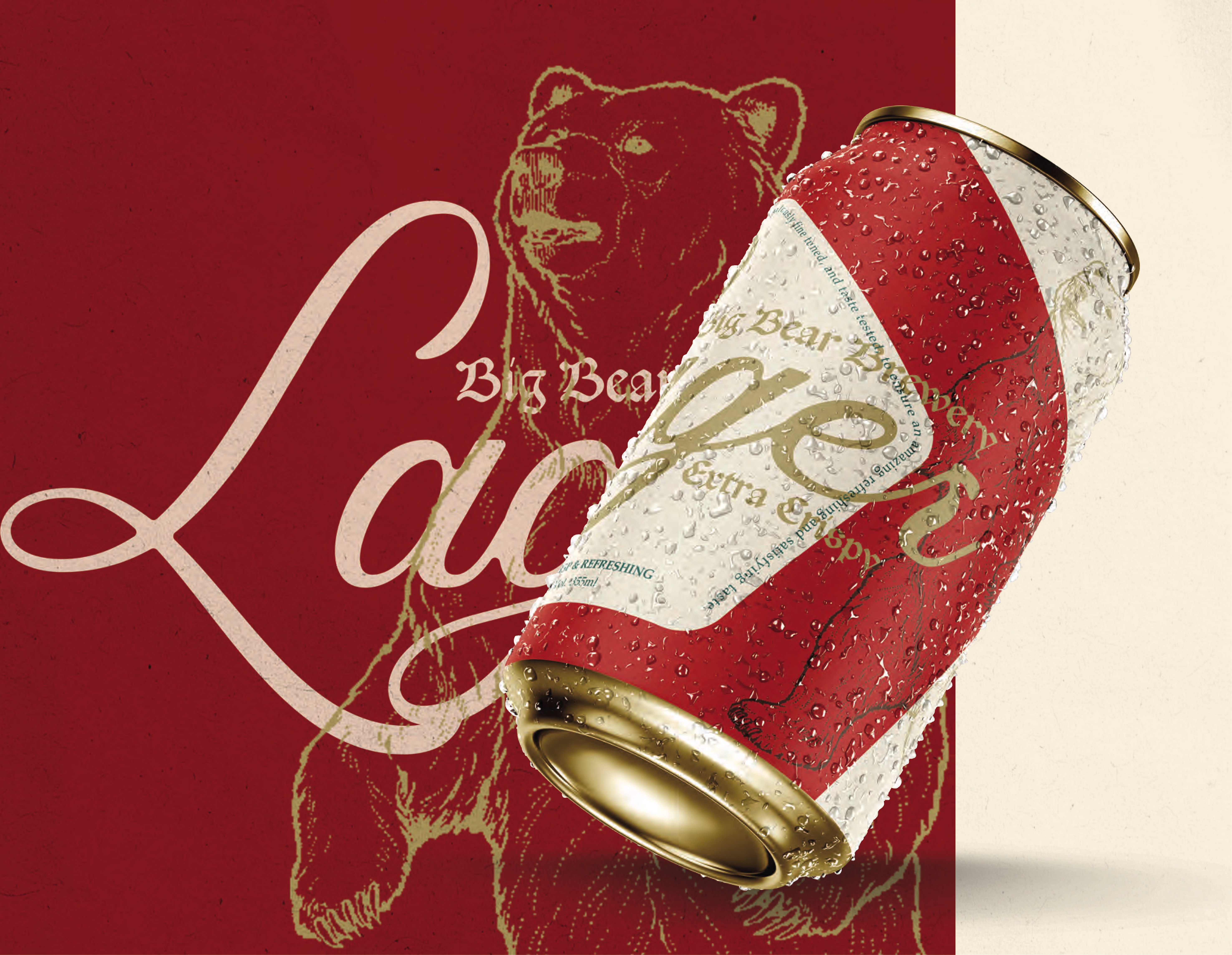
Big Bear Brewing
I’ve spent a lot of time in Kelowna, and on a trip last summer I came across Big Bear Brewing’s lager. I found myself thinking about it from time to time, and on a recent visit to my local liquor store, I was reunited with it. When I first discovered Big Bear’s beers, I was surprised by the price point—and later that night, even more surprised by the quality. Seriously, it’s incredible. But as a designer, I couldn’t help noticing that the packaging felt a bit underwhelming, especially compared to the competition. As a genuine fan of the product, I felt inspired to do something about it and reach out to Big Bear. This redesign was created purely out of respect for the beer and what I believe a crisp, refreshing lager should look like. This project involved a full can redesign, updated packaging, and a collection of marketing collateral.
PACKAGING DESIGN PRODUCT DESIGN CREATIVE DIRECTION
2024
About the Project
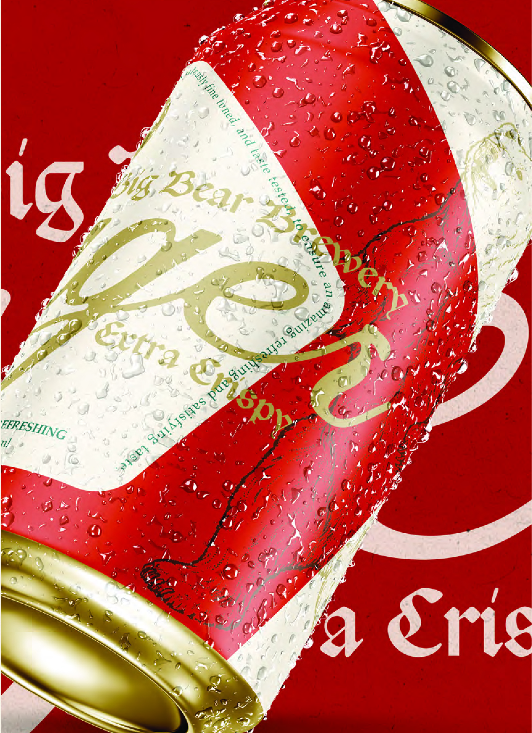
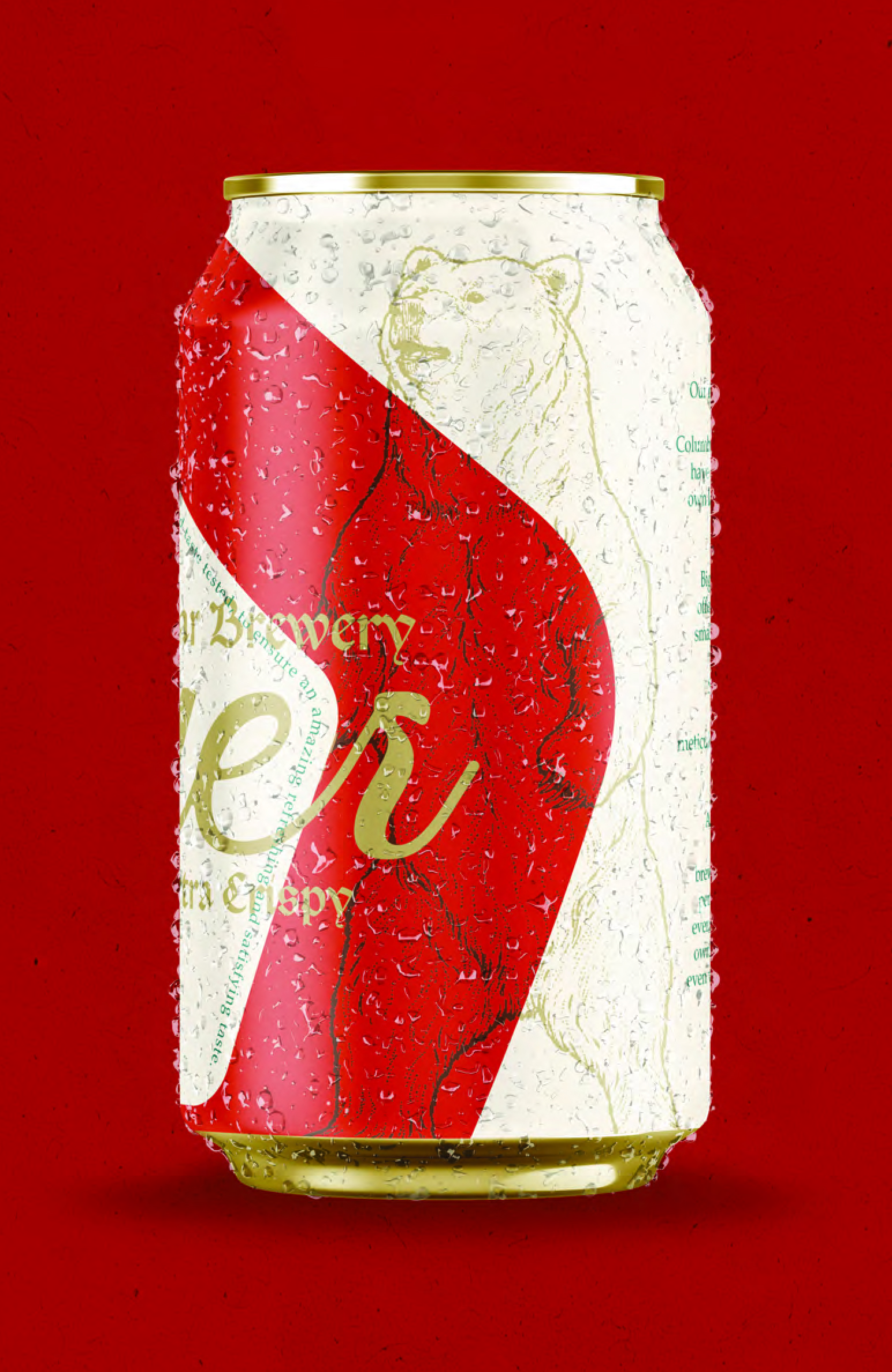
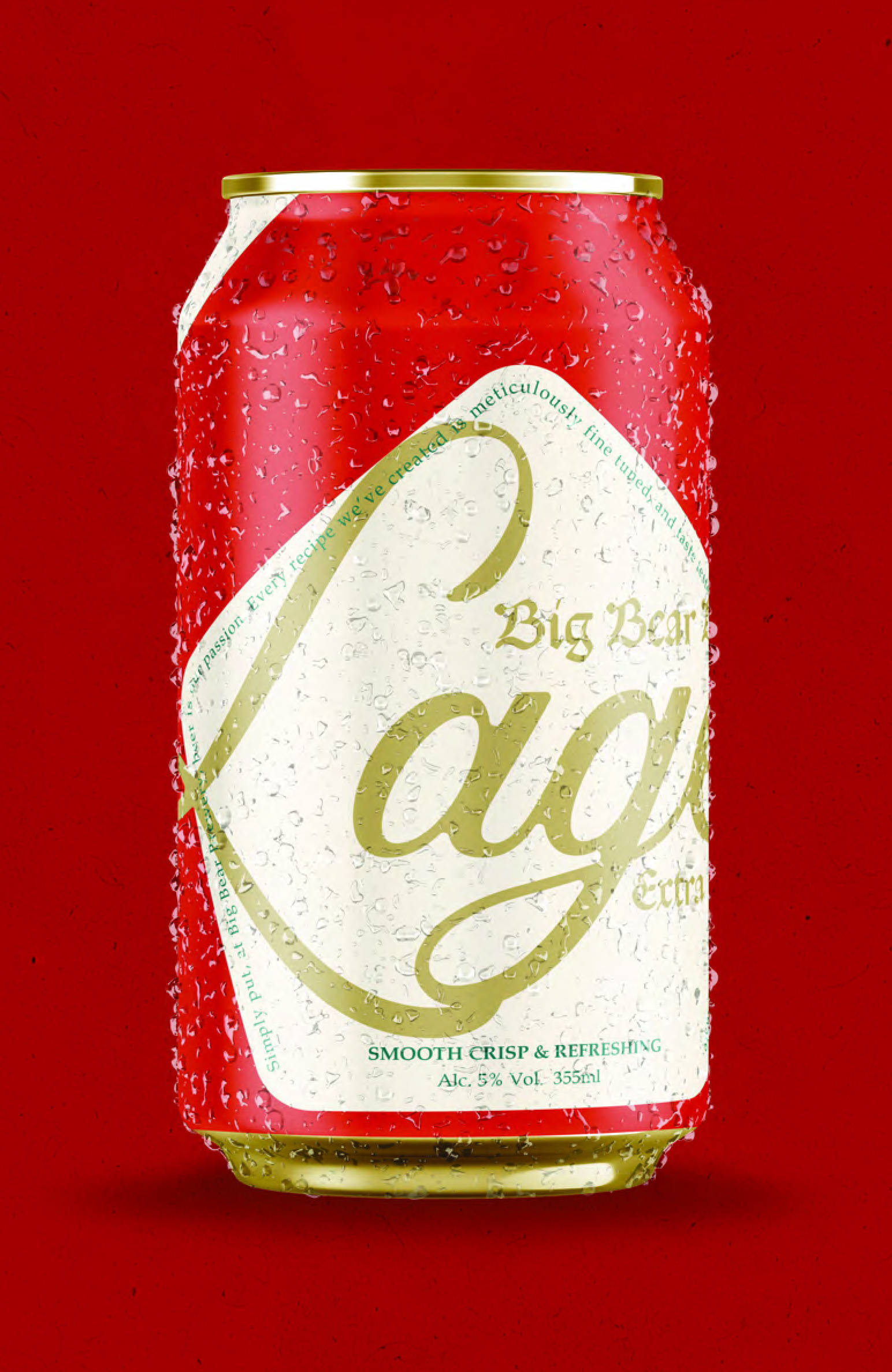
I set out to create a can design that feels bold, confident, and modern while still honoring the brand’s approachable nature. Using strong colour blocking, classic typographic cues, and an illustrated bear as a subtle nod to the brewery’s namesake, the new design introduces a sense of heritage and clarity that aligns with the product’s quality. I wanted to hone in on that feeling of grabbing an ice-cold can straight from the cooler and highlight the refreshing experience the lager delivers, (what does that beer look like?)
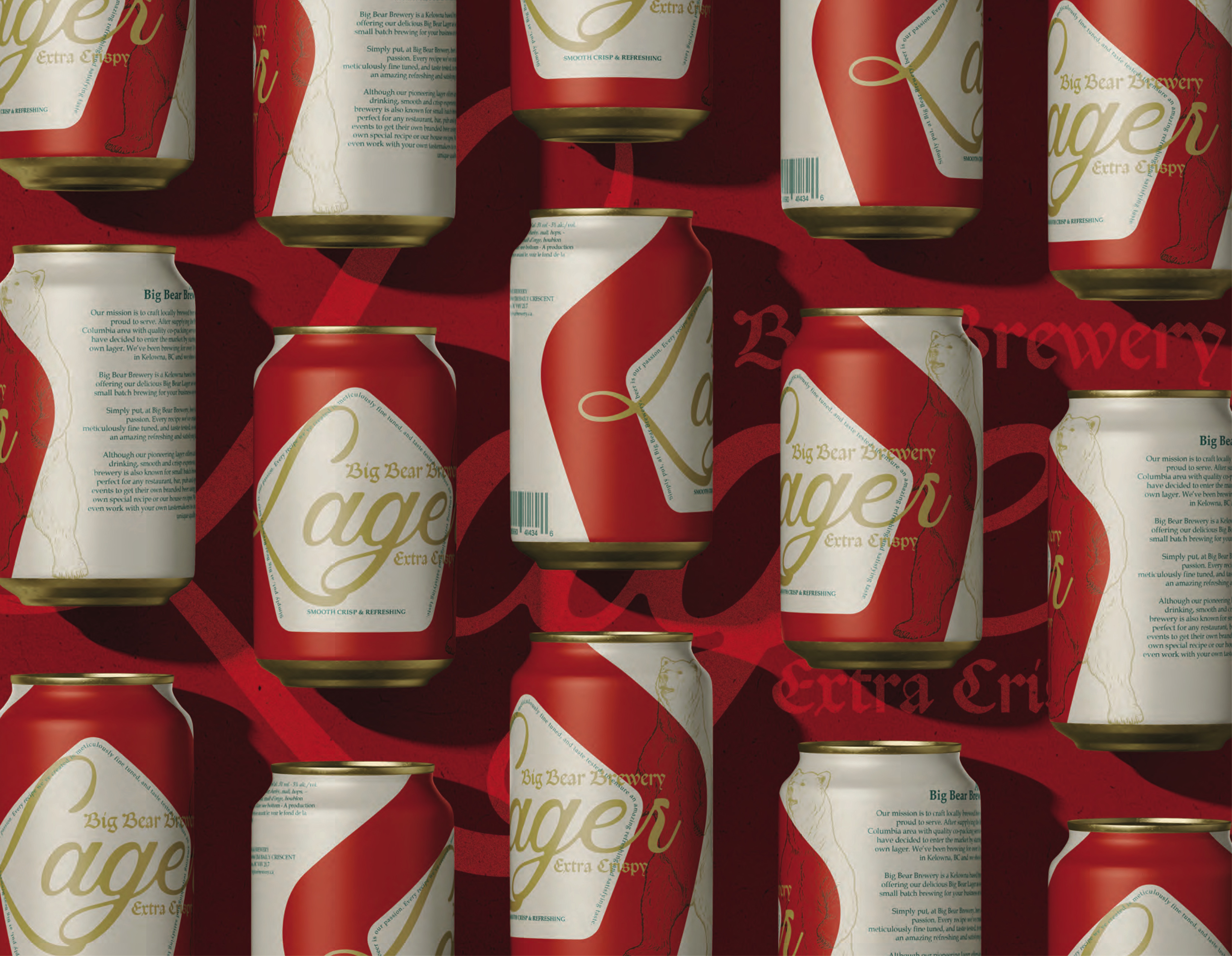
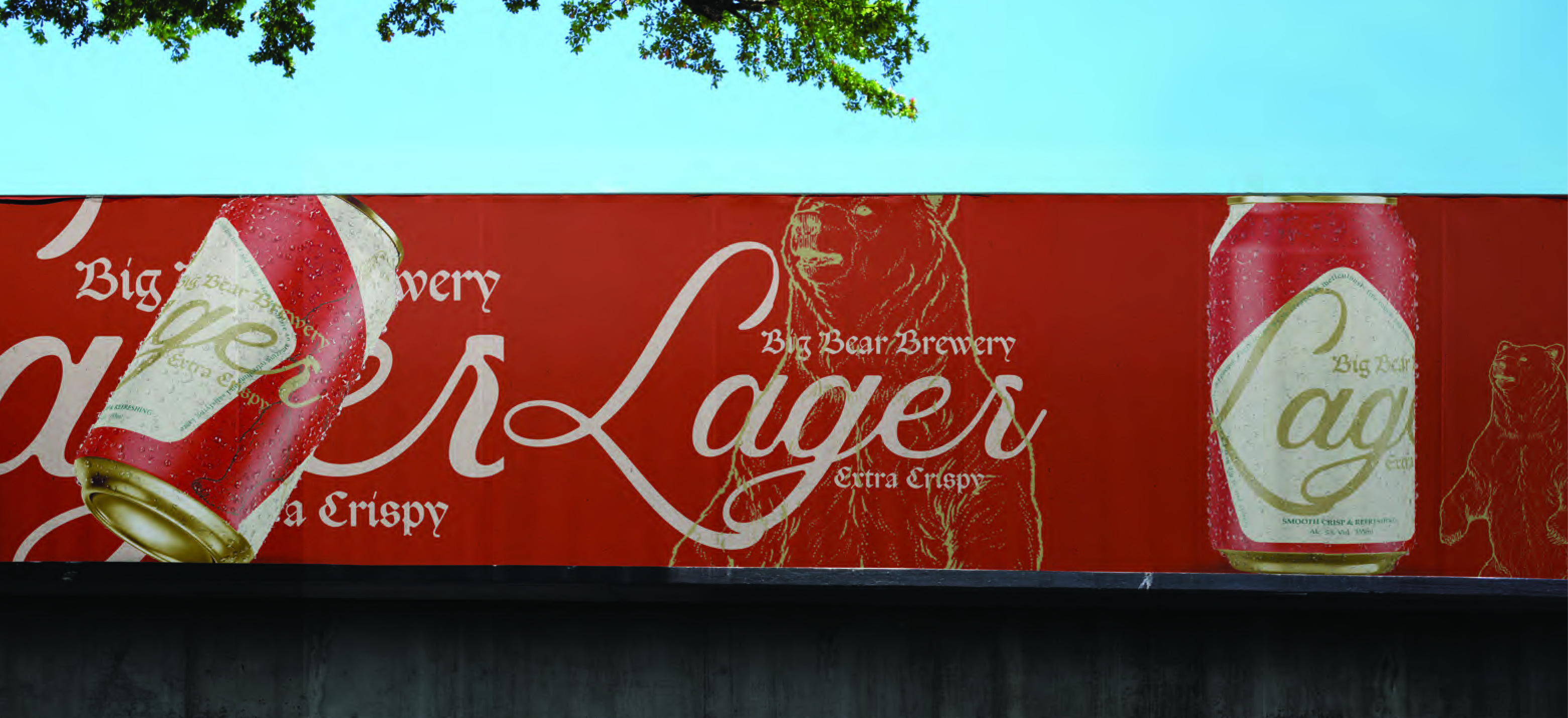
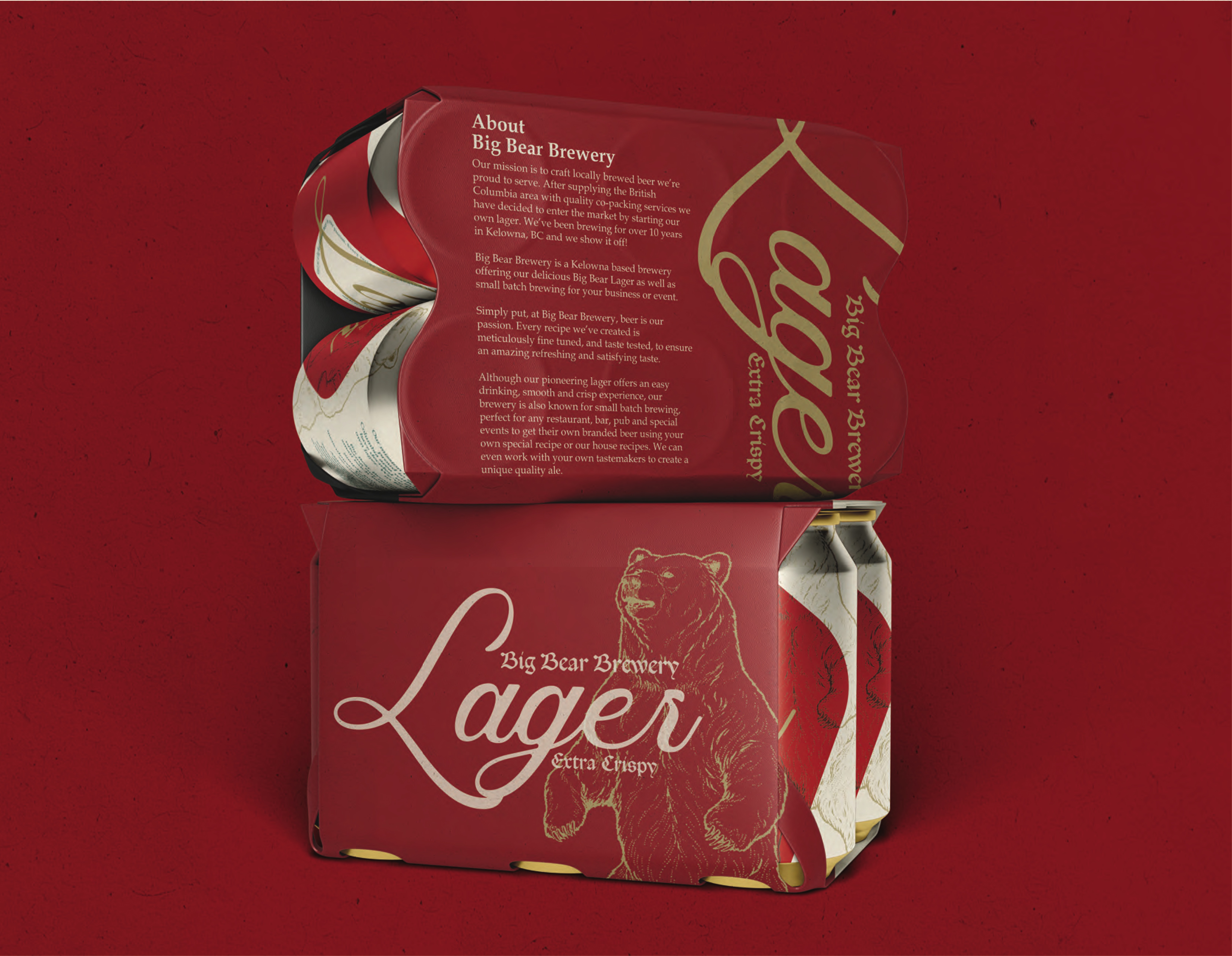
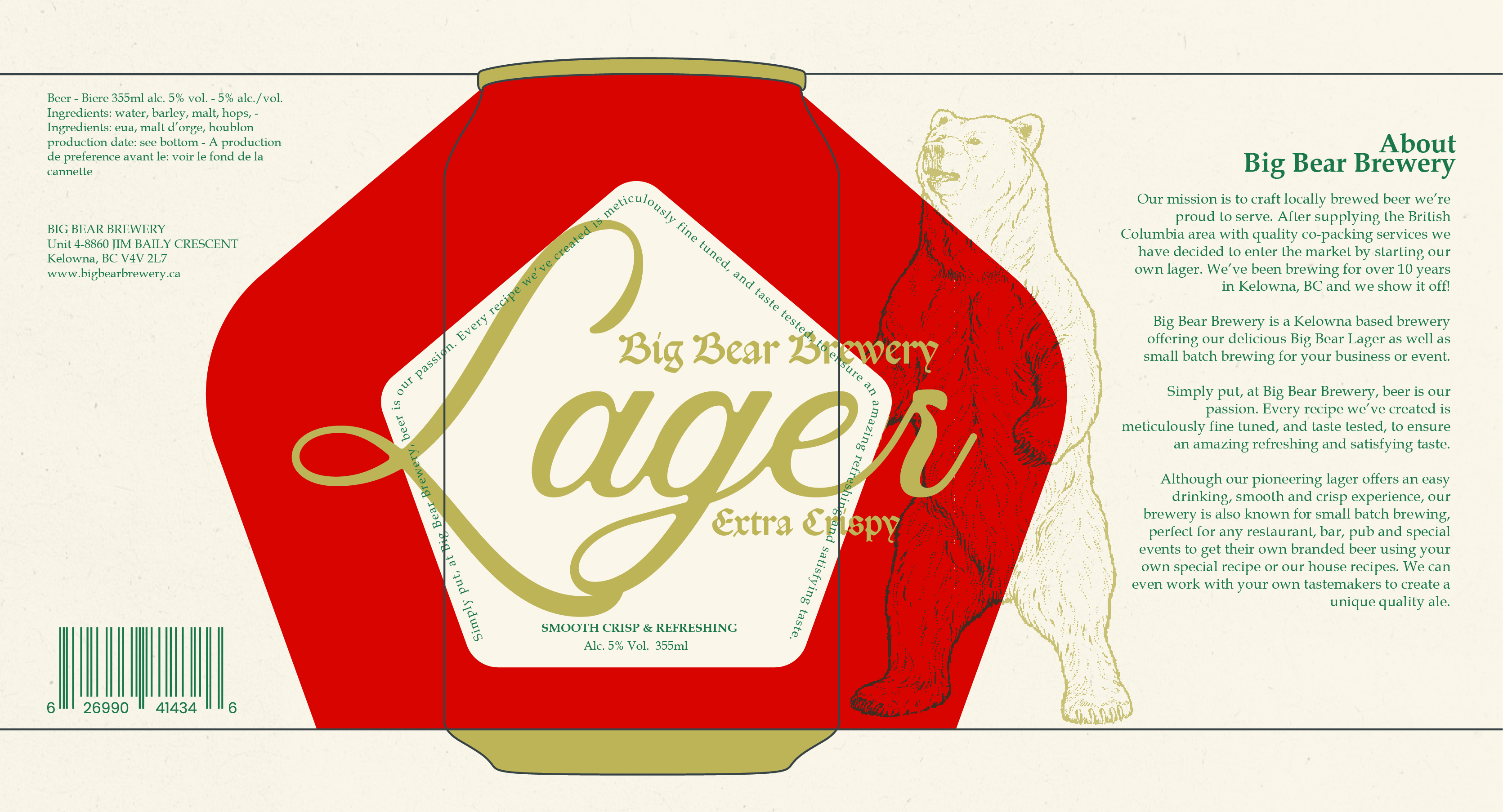
Beyond the can itself, the project expanded into refreshed packaging concepts and supporting marketing collateral, imagining how the updated identity could live across different touchpoints. The result is a cohesive visual direction that elevates Big Bear’s presence on the shelf and reflects the pride that goes into every batch of beer.
.webp)